Understanding the World: Why Maps Are More Than Just Simple Pictures
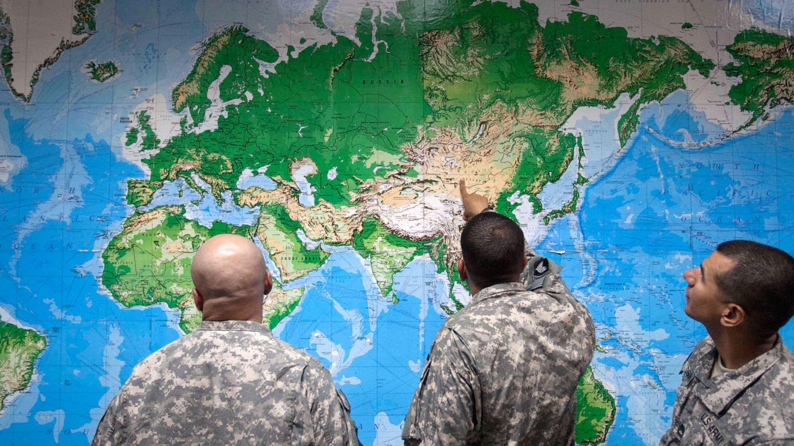
Maps are tools we use every day to navigate our cities and understand global geography. Whether we are using a smartphone app to find a local coffee shop or looking at a globe to learn about international borders, we often assume that maps show us the world exactly as it is. However, experts suggest that maps are not always neutral representations of reality.
When mapmakers create a map, they must make many choices about what to include and what to leave out. For example, the way a country is drawn can change depending on the perspective of the person who made the map. Some maps focus on land size, while others might highlight population density or political alliances. These choices can influence how we perceive the importance of different regions.
In the United States, maps are frequently used to explain complex political situations, such as election results or economic trends. Because these maps are designed to communicate specific information to the public, they can sometimes emphasize certain viewpoints over others. This is why it is important for readers to look at maps critically and understand that they are interpretations of data rather than perfect mirrors of the world.
As technology changes, digital maps are becoming even more influential in our daily lives. Modern mapping software can update information in real-time, helping us track weather patterns or traffic conditions across the country. While these tools are incredibly helpful, they still rely on the data and the design choices provided by their creators.
In conclusion, while maps are essential for our understanding of the world, they are not purely neutral objects. By recognizing that every map has a specific purpose and perspective, we can become more informed citizens. Being aware of how information is presented helps us better understand both our local communities and the global stage.